Branding Illustration.
It was early 2017 we started a pitch at Buck where I had the chance to develop a style for the new illustration system that would be used all over the Facebook platform, crazy enough the style that I proposed ended up being selected to define Facebook illustration new identity.

Alegria.
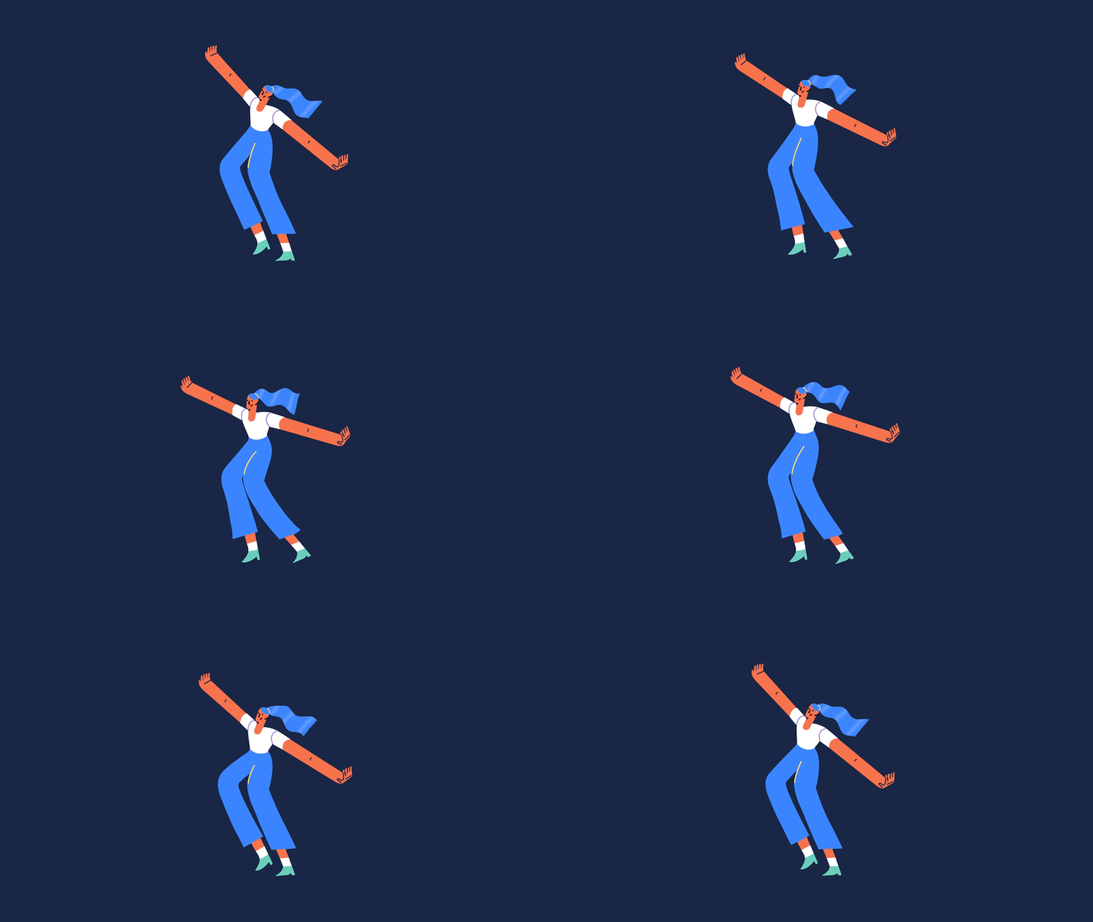
I called the style Alegria which means, in my native language "Joy" because I tried to create characters where that emotion was part of the illustration core. Organic shapes, vibrant colors, exaggerated forms.
After a long process and hard work from the amazing people at Buck and Facebook's team The Collective, my silly illustrations were the starting point to create a style guide and a toolkit that have been defining the palettes, forms and animation.
‘A new style guide, illustration, and animation system for the entire Facebook ecosystem. There’s many imitators, but there’s only one Alegria’
— Buck
Illustrations can create inspiring content for the context of what is being served.
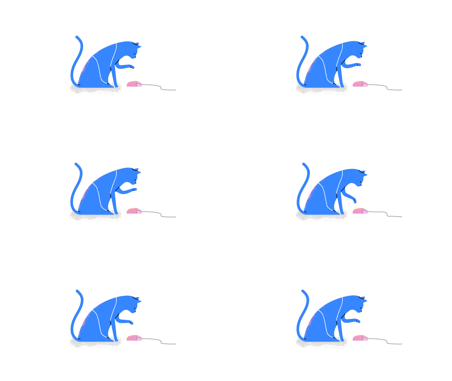
Exaggerated forms are used for their expressive nature and ability to fit into tight compositions. This unique style is important in order to achieve effective integration between product interactions and the product environment.



Surfaces.
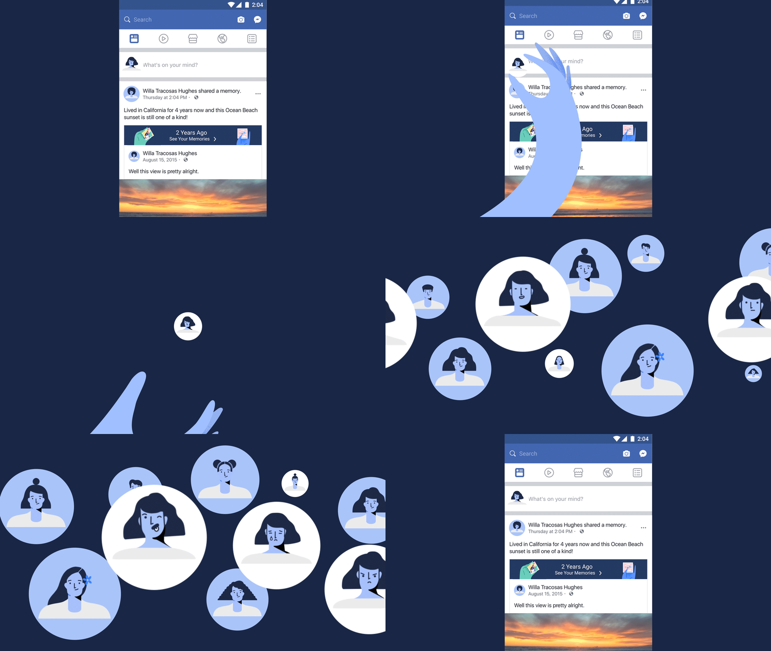
The Illustrations permeate their entire interface — across mobile, desktop, and print.
Visual Principles
Illustrations can create inspiring content for the context of what is being served.
Exaggerated forms are used for their expressive nature and ability to fit into tight compositions.
This unique style is important in order to achieve effective integration between product interactions and the product environment.
Take me to
Editorial.
Take me to

